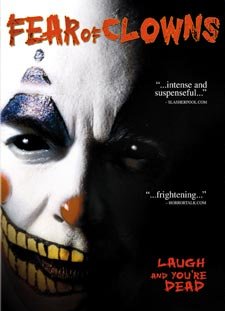
I had a request in the last post from "Aric Blue" to critique the poster for his upcoming Lions Gate release. (Congratulations!)
1. First off, let me say Aric has a good case of hucksterism going because he got me to post his artwork and essentially pimp his film for him. Sam Arkoff would be proud!
2. Not a bad picture per se, but what's happening? Answer: Nothing. This is one of those 3/4 shots you see all the time with action flicks only in their case, they put a scene from the movie in the lower right corner. You don't have any stars in this film except the Clown concept, so you really have to amp that sucker up.
3. I would have given it a wilder, whackier title treatment.
4. "Laugh and you're dead" is not a great tagline. Kind of bland actually. I would have said (off the top of my head), "This is no laughing matter," or, "He'll have you in stitches," or "You'll laugh your head off, " or even, "He's dead serious." Some sort of pun.
5. So what would I have done differently?
a) Used a different shot where the clown was smiling more broadly and maniacally.
b) Worked in some action with his hands reaching out to get you.
c) The eyes are dead, but that may be the motif of the movie. If given the option, I would have altered them to make them wilder and more maniacal.
d) I would have tilted the image slightly - given it a "dutch angle" - to visually increase the weirdness and suspense factor.
e) I would have given it a background, either a circus scene or a different color in order to make the white of his face, and the box in general pop off the shelf more.
Aric, did you guys make up this artwork or did LG?
Either way, best of luck to you. Have Lions Gate send me a copy.
3 comments:
Guys, guess what?
You can't have blood in the artwork if it's an MPAA rated movie. So no matter how much gore or disembowling or whatever you want to see in the art - IT CAN'T HAPPEN.
Hey, you the man! I just thought you might critique it in the comments. To answer your question, LGF came up with that, but it's VERY close to the poster I had commissioned--you can see both at www.fearofclowns.net
In LGF's defense, I didn't give them a TON of stills to work with.
I'm not a big fan of their font. The tagline doesn't thrill me, but I can live with it. I know why people want to go to the "laugh" thing, but it's more of a serious slasher flick--more "Halloween" than "Killer Klowns..."
However, my first flick that got released had a cover that was FAR worse--it used a picture that didn't happen in the movie.
Thanks for taking the time to look(and post!) I knew there was a reason I blog-linked ya! :)
In looking at the piece of art for a horror film, you have to ask the question, "Will it get lost amongst all the other titles on the shelf?"
"Does it leap out at you from ten feet away?"
I thought the Joel-Peter-Witkin- Looking SAW and SAW 2 posters were interesting. I actually liked the one in the first movie with the bear trap head device and the eyes peering out.
I don't see that with HOSTEL. I actually think it's too subtle. You have to READ the poster in order to really KNOW it's a horror movie. There's no ICONOGRAPHY that TELLS you immediately that this is a horror movie.
A movie's poster should grab you and not let go. It should be eye-catching.
It should should tell you what it is in as few images as possible - preferably one strong, overpowering image that instantly communicates.
It should invoke a sense-memory: dread, fear, joy, amusement, whatever.
Does HOSTEL do that?
Post a Comment