The Asylum does good work, they know that the box HAS to jump out at you at the video store or they ain't got nuthin'. Is that Lars Canty's art? Excellent!
wow - i leave a comment, come back a few days later and i've been ripped! sheesh.
"By all the standards by which commercial art is judged - the Train art is much, much better."
nice try. if commercial = pulpy then fine, but if commercial = mainstream, then no.
by any modern major motion picture one-sheet standard the s.o.a.t one-sheet sucks ass and screams low-budget b film.
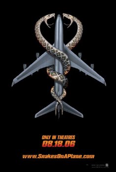
regardless of what kind of film it actually is, the design look for s.o.a.p looks sleek, clean and strong. and it will jump off the shelves when it's surround by all the gaudy-colored pulp titles surrounding it.
if i was in a store i wouldn't look twice at the cover of s.o.a.t, but i'd probably at least give an appreciative one over of the other.
as for why the caduceus? it's an instantaneously recognizable visual turned - with a twist. your eye immediately gravitates toward it. call me crazy but i think that's probably important in commercial design also.
besides, the caduceus is a symbol of the greek god hermes. doing a take on a symbol with wings that represents the messenger for the gods, conductor of the dead and protector of thieves, doesn't seem completely out of place for a struggle between the mob and innocents on a battleground streaking through the sky.
as for this:
"And that kind of thinking gets marketing and art departments fired."
i find it very difficult to believe that anyone associated with the ridiculously successful marketing this film has already had will be fired.
Commercial - according to the dictionary = prepared, done or acting with emphasis on salability.
No, it will not "jump off the shelf." By its very dark nature - it will recede into the shelf. Shadows don't stand out.
And yes, they are going with another key art as you can see. That's what I mean by "getting fired". Your work isn't going to be used. No caduceus poster on bus stops or train station platforms. No billboards when the movie is widely released. No caduceus DVD art.
They were so screwed up they had to save their asses by running a "contest", so they could figure out what to do...
No.
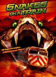
The fact is that SOAT looks a helluva lot more fun than SOAP. They took the familiar image of a train coming out of a tunnel (and I do hope there are a few Freud references in this movie) and twisted it into something spooky and fun. The green eyes of the snake really cap it off nicely.

13 comments:
Much Cooler and more interesting. I hope it's as good as "Night Train to Terror" (1985)
Snakes on a PLANE is about the mob releasing snakes to kill people who are going to testify against them.
Snakes on a TRAIN is about a girl afflicted with a Mayan curse who must get to LA before she gives birth to mystical reptiles...
if we're talking aesthetics then sorry, gotta disagree. the s.o.a.p one-sheet is waaaay better.
I WAS going to be nice about this but:
First off, the Train art has COLOR which allows the art to pop off of any background it's set against... the color also says 'intensity.'
There is DEPTH to the Train art whereas the Plane art is flat. The color is muted.
There is perceived MOTION in the Train art, whereas you get nothing with the Plane art.
The symbolism of the Plane art mimics the caduceus - the international symbol for medicine AND HEALING.
EXCUSE ME?!!
THIS IS MUTHER-FUCKIN' SNAKES ON A MUTHER-FUCKIN'PLANE!!
It's about snakes biting the shit out of people!
Talk about your "mixed messages."
By all the standards by which commercial art is judged - the Train art is much, much better.
The plane art SUCKS ASS!
Mad Pulp Bastard, you are my kind of producer. Straight forward and right on target. The airplane poster is so homogenized. Nice work Asylum.
My guess on the caduceus is that someone in the art department thought it would be cool, but has no idea what it means.
And that kind of thinking gets marketing and art departments fired.
The Asylum does good work, they know that the box HAS to jump out at you at the video store or they ain't got nuthin'.
Is that Lars Canty's art? Excellent!
I just emailed Lars - so we'll find out. Lars and I created a lot of stuff together when we were at York.
Not Lars' art, but he passed the well-wishes on to the artist.
wow - i leave a comment, come back a few days later and i've been ripped! sheesh.
"By all the standards by which commercial art is judged - the Train art is much, much better."
nice try. if commercial = pulpy then fine, but if commercial = mainstream, then no.
by any modern major motion picture one-sheet standard the s.o.a.t one-sheet sucks ass and screams low-budget b film.
regardless of what kind of film it actually is, the design look for s.o.a.p looks sleek, clean and strong. and it will jump off the shelves when it's surround by all the gaudy-colored pulp titles surrounding it.
if i was in a store i wouldn't look twice at the cover of s.o.a.t, but i'd probably at least give an appreciative one over of the other.
as for why the caduceus? it's an instantaneously recognizable visual turned - with a twist. your eye immediately gravitates toward it. call me crazy but i think that's probably important in commercial design also.
besides, the caduceus is a symbol of the greek god hermes. doing a take on a symbol with wings that represents the messenger for the gods, conductor of the dead and protector of thieves, doesn't seem completely out of place for a struggle between the mob and innocents on a battleground streaking through the sky.
as for this:
"And that kind of thinking gets marketing and art departments fired."
i find it very difficult to believe that anyone associated with the ridiculously successful marketing this film has already had will be fired.
Commercial - according to the dictionary = prepared, done or acting with emphasis on salability.
No, it will not "jump off the shelf." By its very dark nature - it will recede into the shelf. Shadows don't stand out.
And yes, they are going with another key art as you can see. That's what I mean by "getting fired". Your work isn't going to be used. No caduceus poster on bus stops or train station platforms. No billboards when the movie is widely released. No caduceus DVD art.
They were so screwed up they had to save their asses by running a "contest", so they could figure out what to do...
No.
The fact is that SOAT looks a helluva lot more fun than SOAP. They took the familiar image of a train coming out of a tunnel (and I do hope there are a few Freud references in this movie) and twisted it into something spooky and fun. The green eyes of the snake really cap it off nicely.
Post a Comment