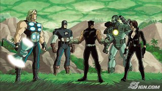
I reviewed the first venture in this series ULTIMATE AVENGERS here, and while I'm pleased to say that UA2 is a step up from that, Marvel still has a long way to go if they want to catch up with the animated activities of Warner Bros.
(It seems almost fitting that Warners can't make a live action movie version of their comic properties (at least Superman), while Marvel can't make an animated film that works - or at least a movie. Their series are okay.)
UA2 is a show that really lacks design and vision. From character design to background to vehicles, this movie is well, lackluster. Add to that the utter dearth of intensity in any of the scenes and you pretty much have something that will only entertain the smallest ones in the house, although it wasn't designed for them.
Another gripe I have with the movie is the following (bear with me as I pick a nit):

You'll notice the Black Panther here? Compare him to the one on the box.... See the difference?
The other heroes are consistent with their design.
And even these designs veer away from the original design, which in my mind is more mysterious and far cooler.
Is it me or does it seem, I don't know...LAZY ... for the Lionsgate's art department not to match the character on the casewrap to the movie? Does the Black Panther character in the movie look "watered down" to you? Especially when he was originally designed to look like a dark African avenger?
1 comment:
BP looks deflated, like he forgot to take his steroids or went on a vegan diet.
Post a Comment