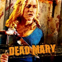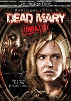
Here's one of the titles I've been working on for Peace Arch's international sales.
(Clean art, no taglines nor credit block info)
Here's the DVD casewrap of the upcoming domestic release by Genius Products.
They are two separate interpretations of the same story. Ours was a more gritty, rural approach of a woman trapped in a remote cabin. Their's picks up on the reason all hell breaks loose - the children's game of looking into the mirror and saying, "Dead Mary" three times.
My tagline was better - You always hurt the ones you love - which is the central conceit of the story. Everyone turns on one another because they don't know who's possessed by the spirit of Dead Mary. Their title treatment is better.
Both are only able to show blood because they aren't MPAA rated key art. If this film were rated R then there could be NO blood or suspicious fluids in the artwork.
I can't wait to show you guys the art for LIVING DEATH, BOTTOM FEEDER, THE MAD, THE STILLBORN and HARM'S WAY.

3 comments:
2nd one's better in my opinion. The first has that retro 70's look to it, which may be in vogue today but really never floated my boat.
If this film were rated R then there could be NO blood or suspicious fluids in the artwork.
Seriously? I didn't know that. Very strange.
KJC (who also likes the 2nd one better)
We called her Bloody Mary where I come from.
And you had to do it 13 times, in the dark, turning around in front of the mirror between each recital of her name.
I love me the children's folk tales.
Post a Comment