Showing posts with label pulp art. Show all posts

Monday, September 20, 2010

Killer Covers: "Pulp Covers... were Designed to Sell!"

Killer Covers pulls a great quote from the UK's Independent newspaper regarding a recent auction of pulp fiction art:


It’s a peculiar discipline, pulp. The purpose--back in the smoky, inter-war days when the cheaply produced magazines would line the news-stands--was always practical. Pulp covers, like the airbrushed supermodels who replaced them, were designed to sell. There was no whimsical expression of artistic impulse; no desire to appeal to a higher plane. Illustrations had to catch the eye of the passing customer, and that was all. Competition was fierce and covers had to be striking. They featured grotesque creatures of the night, outlandish specimens from outer space, and--almost always--a scantily clad damsel in distress.

“The appeal lies in the lack of subtlety,” [Heritage Auctions vice-president Ed] Jaster explains. “It is the art of the masses. It exists outside the conventional artistic boundaries, yet it elicits this visceral reaction. The women are beautiful, the men are handsome. There’s sex appeal, danger, good and evil.”
and of course, this gem: 

Perhaps, though, it's no wonder that pulp art is having a moment in the spotlight. So steeped in romance are its origins – the fakery, the freight trains, the fast-and-loose nature of the stories it decorated – that it is surprising it hasn't happened sooner. And the artists aren't without their claim to history; Frank R Paul, for instance, is frequently credited with the first illustrated depiction of both a space station and flying saucer, a seminal pop-cultural symbol if ever there was one.

Monday, August 23, 2010

Retro Poster Design Tutorial

Tim Shrumm sent me a link from Adam Levermore on How to Design a Retro Sci Fi Poster.

This is excellent, step-by-step instruction on creating your own pulpy comic and mag covers.

Get out there and fire up your Photoshop!

Thursday, June 03, 2010

Pulp Profile: Mike Fyles

Peter Miller has a profile piece up on pulp artist Mike Fyles that you should check out. 


Especially a link to a tutorial Mike has on creating a pulp illustration.

I have a couple of posts on Mike here.

Wednesday, January 20, 2010

Wednesday, December 16, 2009

Mike Fyles: Pulp Artist

I ran across Mike's work through my connections at The Pulp Factory and was astounded at the sheer unabashed pulpiness of his illustrations. Bravo!

You can download more of Mike's work here, at COMMANDER X ADVENTURES or browse through his website. Below is a special story by none other than "Pappy" himself - Ron Fortier.


Thursday, September 17, 2009

Tuesday, May 12, 2009

Major Spoilers: Scotty Godlewski

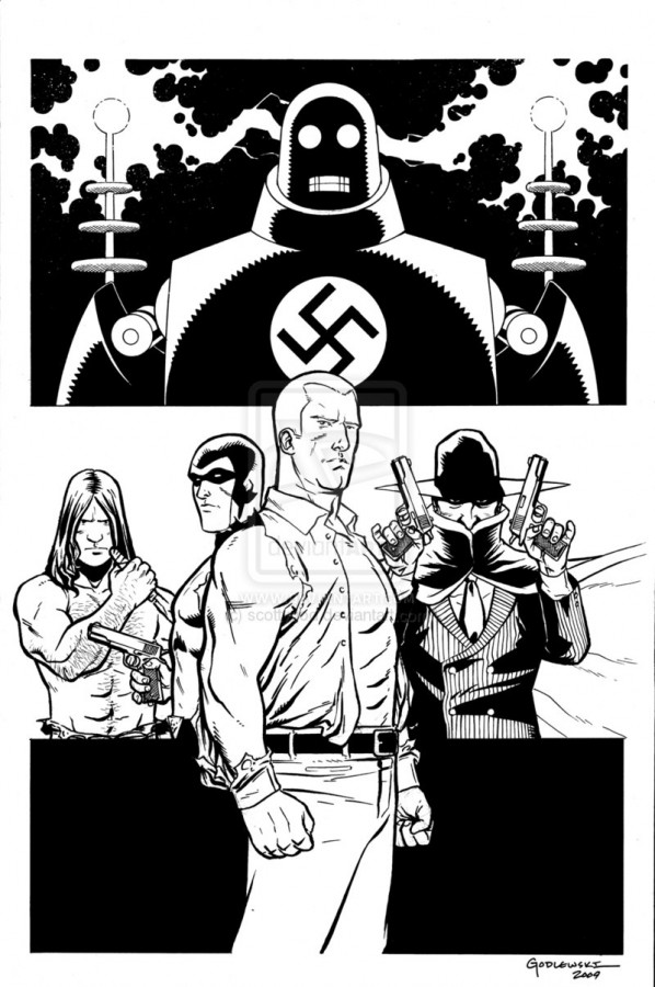
Our own Scotty Godlewski (yes, he's ours now... muahahahaahaha!) who designed our Knightmare logo and ad has a wonderful bit of pulpiness up over at Major Spoilers.

You can see more of Scotty 's pulpiness here.

Saturday, March 14, 2009

Good Design Speaks for Itself


This is absolutely one of those situations that I love:

Making what you have work.

The only images of The Bat available were scans from the yellowing wood pulp pages... how do you make a cover out of that?

By turning your weaknesses into strengths.

Kudos to Altus Press.

Friday, March 13, 2009

Pulp Painting...


I like first drafts...I really do.

There's nothing like the excitement and tension you feel after typing FADE IN and realize you are going to fill approximately 95+/- pages until you reach FADE TO BLACK (but in this case it's more like CUT TO BLACK since this is an action movie).

But there's a whole other level of excitement at work in the process beyond writing something like:

"Our heroine races headlong at the oncoming tram, bullets striking all around her as she..."
[REDACTED]

No, the real excitement is knowing that after you get through with the first draft - you can get to the real work of layering everything. Because the script isn't the final product - the movie is - and after you write that first draft, then you can begin to write the movie.

"Writing the movie" is that point (for me) when you have the canvas in front of you. It's the right size and shape and you've spent all this time thinking about what you're going to paint. The first draft is that coat of white gesso paint you apply to the canvas so that everything else sticks to it:

Your background, your foreground, your mid-ground, your highlights, your shadows and then your detail.

That's how paintings are built and that's how screenplays are built - in layers. This is especially true for screenplays for low budget films because those layers have to work together to "paint the picture" effectively without you running out of paint.

But what are the analogues of story to painting?

Your background is the world your story takes place within.
Your foreground is your main character(s) - the subject of your focus.
Your midground is your supporting characters - spaced between your focus and your world.
Your highlights refer to your main characters' best qualities.
Your shadows refer to their worst qualities - their weaknesses or flaws.

  • Your heroes or villains can't be all highlight or all shadow or else they don't work with (or against) the background.
  • You can't put too many characters in (your mid-ground) or else you lose focus on your foreground (your hero).
  • And your background can't be all one color (emotion) because you lose all the wonderful, interesting detail.
Have a good weekend. I'll be slapping paint.

Wednesday, February 25, 2009

Sean Phillips Rocks


Just in case you didn't already know that. I've been cropping a couple of his images lately to use as headers for the blog and I wanted to give him the credit he deserves.

He can be find here. Go. Be amazed.

Thursday, October 16, 2008

Know Your Story


Filmmaking
is all about structuring a series of sounds and images to communicate a story.

Graphic Design is all about communicating a story with one image.

Since we've been discussing this issue, I wanted to make that distinction perfectly clear because they are two branching skill sets derived from the same root:

Telling a story.

Filmmakers: I'm seeing a lot of your posters (and feel free to send me your images via a link) and I am now understanding that your skill set is the synthesis of those images. That's why I've been seeing posters that are multiple images all over the place - the static version of a montage. You're "stuck" in that mode of thinking that you can't tell your story with just one image.

I'm here to tell you that you can.

Graphic designers: I'm seeing your poster designs and I'm now coming to the conclusion that you aren't being briefed on the story you need to tell. I'm here to say that you must understand the story first before you lay a hand on the mouse and start designing. That means actually reading the text you are laying out. That means going through the movie's synopsis (which the filmmaker has written in 2 paragraphs if he knows what's good for him) and all the stills with a fine tooth comb. That means looking at previous movies in the particular genre.

Because no one wants a poster that may look cool, but totally misses the core of the movie and thus, potential sales.

This is why I like pulp magazine covers - because many of them are simplified versions of scenes from the stories within (in many cases the art was created first then the story writ to suit). Those covers ignore all of the boring surrounding details and focus on the most exciting, dramatic, heart-wrenching aspect of the story.

And that kids, is what sells tickets.

Saturday, October 11, 2008

Old Pulp Never Dies...


It becomes a calendar... available at your local Barnes & Noble.

I like this cover and the title treatment, but I'm not sure the rest of the year lives up to this cover.

(The artist here looks like Norman Saunders who also gave us the wonderful Mars Attacks cards, but I'm not 100% sure...anyone sure?)

Thursday, October 09, 2008

Who Here Remembers War Comics?


While we here on the American shores were devouring the likes of SGT. ROCK, THE UNKNOWN SOLDIER, THE HAUNTED TANK, THE LOSERS and ENEMY ACE, our British cousins were devouring these pulpy bits of goodness.

From Today's Inspiration.

Day One

Day Two

Day Three

Day Four

Tuesday, July 22, 2008

I'll Be Superamalgamated!

I was trolling the internet looking for evildoers and found this (courtesy of Groovy Age of Horror).


I hope that one day - sooner rather than later - someone gets to write these adventures.